What are KPI Reports? Your Complete Guide with Interactive Examples
I share how I use KPI reporting to guide decisions, with uses, pros and cons, AI impact, dashboards versus reports, a creation framework, and templates.
I always begin my strategic work with strong KPI reporting because it gives me a clear understanding of where performance stands and what needs attention. When I see my KPIs presented clearly I feel more confident in every choice I make because the data reveals what truly moves the business in the right direction.
What Is a KPI Report
When I describe a KPI report I call it a structured summary of the most important indicators that show how well a project or team is performing. It becomes a simple blueprint that highlights progress problems and opportunities. A good KPI report removes noise and focuses only on the story that matters most.
I treat KPI reports as focused snapshots of performance. They avoid unnecessary detail and emphasize the core signals that influence decisions. Whenever I create one I select only the essential metrics that directly tie to the goal of the project or initiative.
What Are KPI Reports Used For
I rely on KPI reports to understand how efficiently my team is moving toward key goals. They help me measure progress evaluate campaigns and monitor changes over time. When I share them with leadership these reports unify everyone around the same view of performance.
I also use KPI reporting to guide planning. When I recognize patterns in my reports I can predict future results more accurately. This helps me prepare better strategies because the insights reveal what can succeed and what needs adjustment.
Pros and Cons of Sharing KPI Reports
I have learned that sharing KPI reports can be incredibly powerful but also challenging if not managed carefully.
Pros
I notice deeper alignment when teams see shared KPIs because everyone understands the targets. Shared reports reduce confusion and support accountability. They remove emotional decision making because the data speaks clearly to what is working and what needs more attention.
Cons
Sharing KPI reports can create stress if the audience reacts emotionally to negative numbers. Without context a single metric can be misunderstood. I also see teams sometimes chase KPIs rather than meaningful outcomes when the goals are not communicated well.
Why It Is Hard to Scale Reporting
As teams grow reporting becomes much harder to maintain. I often deal with data scattered across multiple systems which makes the process slow and prone to errors. Manually collecting information drains time that could be spent on real work.
I also notice that inconsistent definitions create confusion. When teams count metrics differently reports lose meaning. Without a unified structure the reporting process becomes fragmented. This prevents accurate comparisons and slows decision making.
Manual reporting simply does not scale. When the business grows the number of stakeholders grows with it. If every report requires manual effort the workload becomes endless and overwhelming.
How AI Makes Scaling Reporting Easier
AI changed the way I manage KPI reporting because it removes many painful bottlenecks. Instead of spending hours gathering data I can let AI automate the process and surface insights for me. This prevents costly human errors and speeds up analysis.
AI also helps me identify trends that my eyes may miss. It can scan large data sets quickly and highlight changes that matter. This allows me to take action sooner because I can understand what is happening without waiting for the next reporting cycle.
The conversational nature of AI makes the experience even stronger. I can ask questions about my KPIs and receive immediate explanations without needing to build a new dashboard or write queries.
Related Article
If you’re interested in new approaches to analytics, check out “What Is Agentic Reporting?” for a look at how AI-driven reporting transforms how teams interact with their data and insights.
The Difference Between a KPI Report and a KPI Dashboard
I often explain that the difference between a KPI report and a KPI dashboard feels like the difference between a still photograph and a living scene. A KPI report captures a single moment. A KPI dashboard lets me explore performance as it changes.
When I build a static KPI report I freeze time. I share a structured document that anyone can understand. It stays simple and digestible. The challenge is that the data stops updating the moment I publish it and the reader cannot explore anything beyond what I chose to include.
A KPI dashboard is the complete opposite. It updates in real time and gives me the freedom to click deeper into the data whenever I want. I can look at patterns compare segments and uncover insights that do not show up in static reports.
Below is a comparison table that shows the core differences.
| Type | Description | Advantages | Limitations |
|---|---|---|---|
| Traditional Static KPI Report | A fixed document created at a specific moment | Simple to understand and easy to distribute | Data ages quickly and the reader cannot explore |
| Interactive KPI Dashboard | A live view that updates continuously | Enables deep exploration and reveals more insights | Requires user comfort with digging into data |
I rely on both formats depending on the situation. Static KPI reports help me communicate cleanly with broad audiences. Dashboards help me investigate the story behind the numbers and make faster decisions.
Guide on How to Create KPI Reports
Over time I developed a framework that keeps my KPI reporting consistent and impactful.
Step One: Choose the Goal
I begin by asking what question the report must answer. Clear goals prevent clutter and help me focus on valuable insights.
Step Two: Select Essential Metrics
I choose only a few indicators that directly connect to the goal. This keeps the report meaningful and avoids overwhelming the reader.
Step Three: Collect and Clean Data
I verify data quality before building the report. Clean and consistent data makes every insight trustworthy.
Step Four: Add Context
I compare the data with historical performance and note external events that may influence the results. Context turns numbers into a narrative.
Step Five: Present the Insights Clearly
I use simple charts that highlight the story at a glance. A clear visual always communicates better than a complex design.
Step Six: Outline Action Items
I always end with steps that respond to the results. Action turns reporting into progress.
Best Practices I Follow for KPI Reporting
Experience taught me that the best reporting focuses on clarity consistency and action. I keep my metrics stable so that I can compare results accurately over time. I remove vanity metrics because they distract from real progress.
I also make sure each report includes a clear narrative that explains what the data means. Without explanation readers can misinterpret the information. My goal is to guide understanding not create confusion.
Regular reporting cycles also matter. Predictable updates help everyone stay aligned and make performance part of the team culture.
KPI Report Examples and Templates
I often rely on templates to structure my KPI reports and keep everything consistent across teams. Here is one I use frequently.
| KPI Category | Metric | Purpose | Example Use |
|---|---|---|---|
| Acquisition | New Leads | Tracks growth of early funnel activity | I review this weekly to monitor marketing impact |
| Engagement | Active Users | Measures product stickiness | I use it to understand retention patterns |
| Revenue | Monthly Revenue | Shows financial performance | I compare programs and forecast targets |
| Efficiency | Cycle Time | Shows speed of operational work | I track this to improve workflow productivity |
| Retention | Renewal Rate | Measures user loyalty | I use this to predict long term revenue strength |
This kind of structure keeps my thinking organized before I create full visual reports. I can adjust the categories depending on the team or industry.
I also create narrative templates with a summary section at the top followed by visual trends and final recommendations. This ensures each report tells a complete story from insight to action.
Example KPI Reports
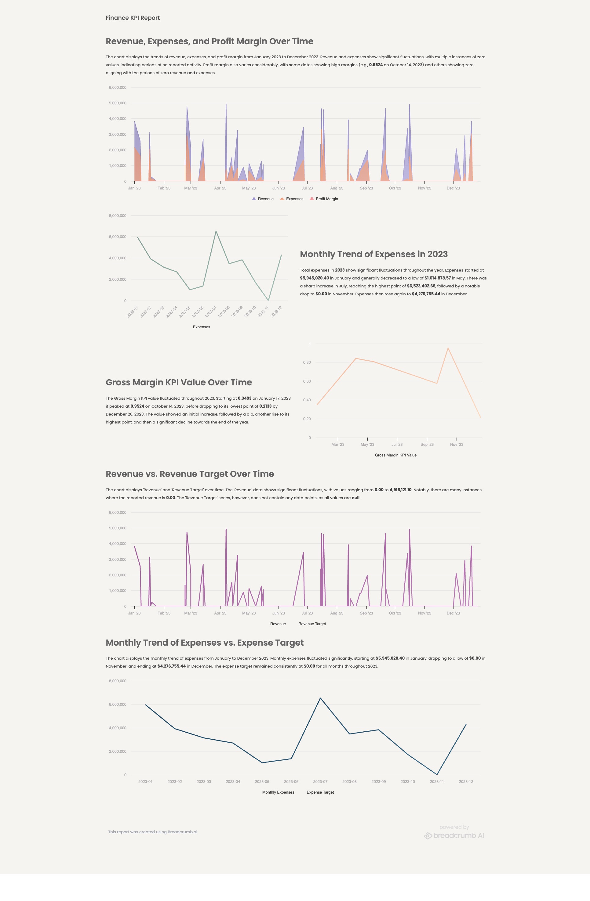
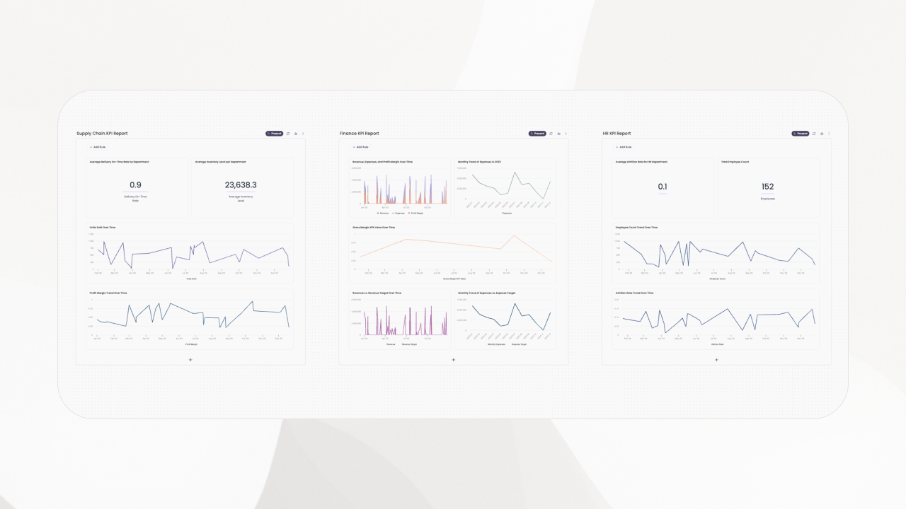
Finance KPI Report
Highlights revenue gross margin operating expense and cash runway to track financial health and support capital planning.
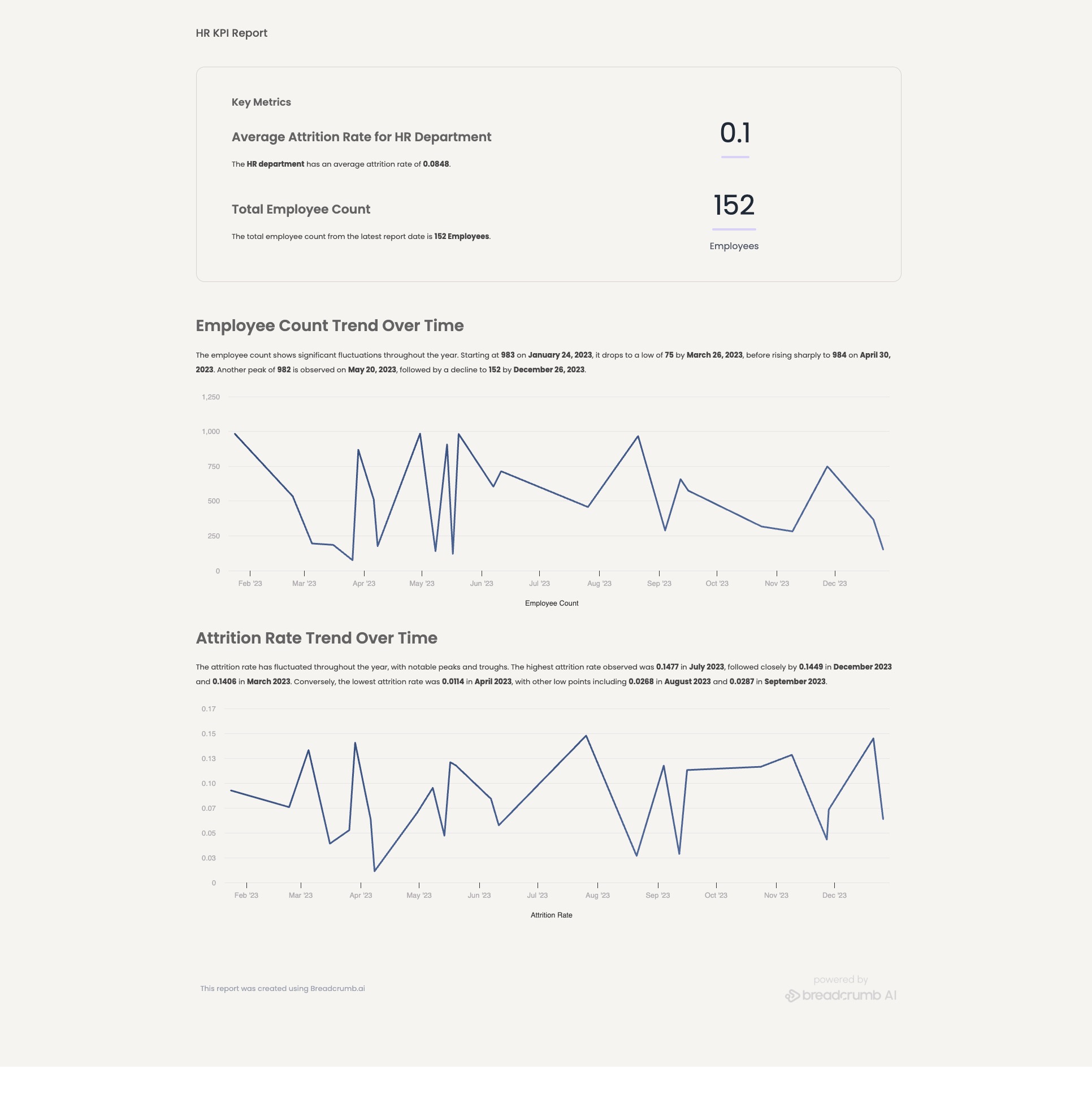
Human Resource KPI Report
Tracks headcount time to hire retention and engagement to assess workforce health and forecast talent needs.
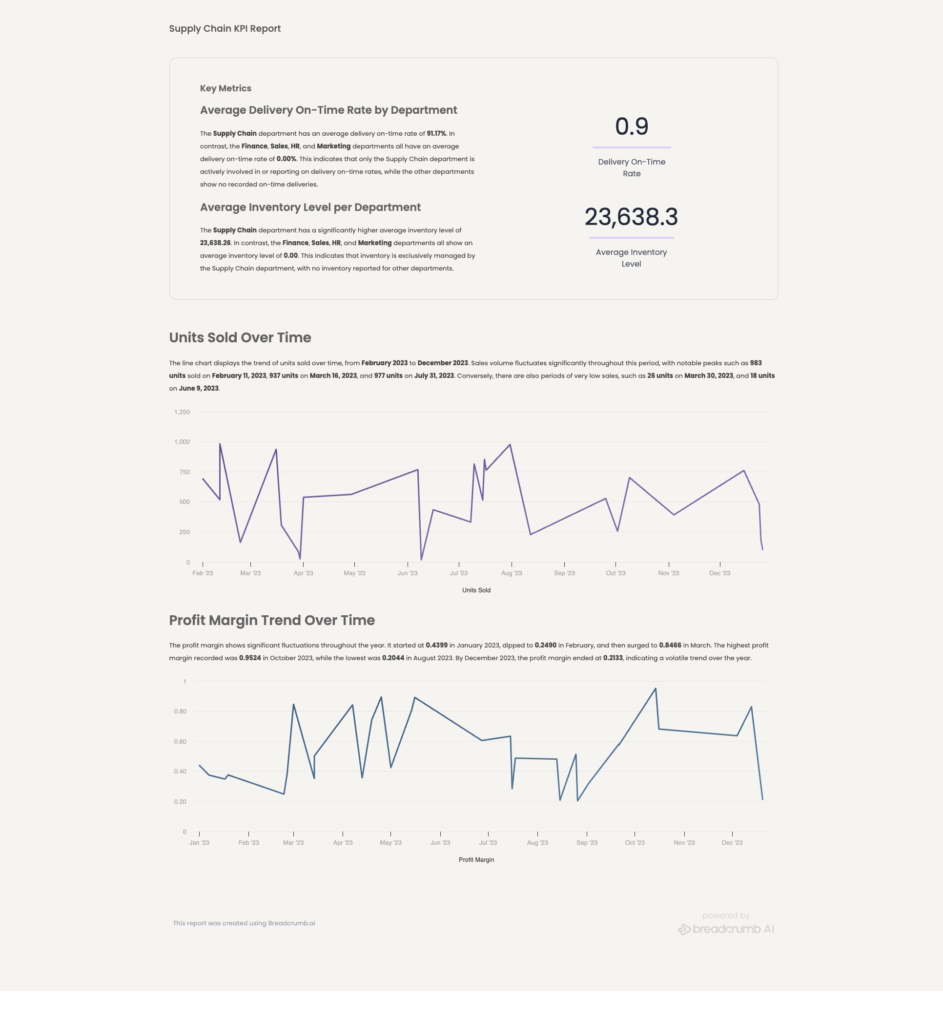
Supply Chain KPI Report
Measures inventory turns on time delivery lead time and defect rate to improve reliability and reduce costs.
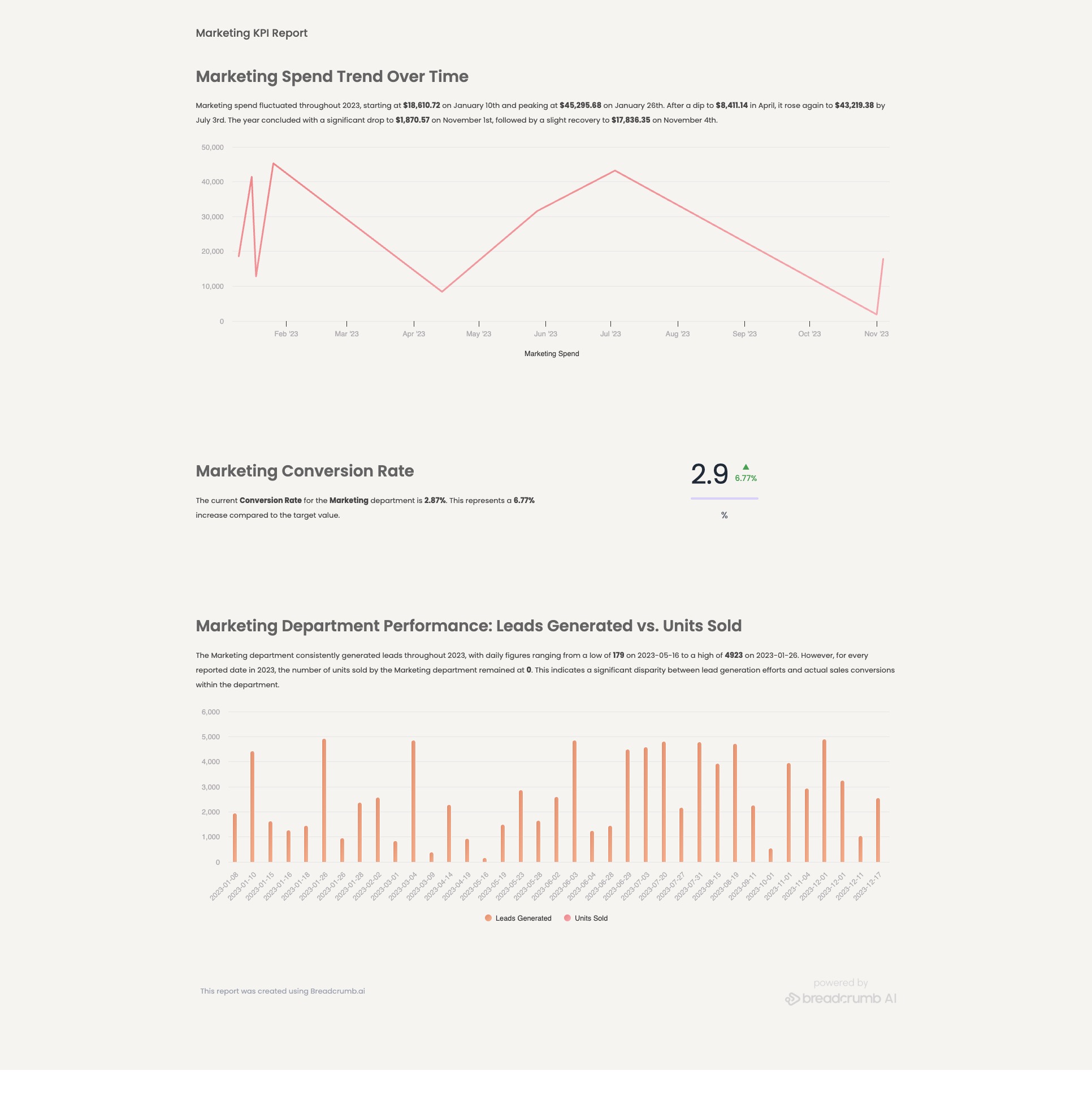
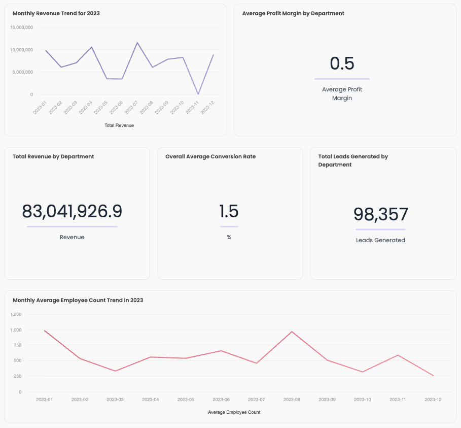
Marketing KPI Report
Reports pipeline contribution cost to acquire conversion rate and channel performance to guide efficient spend.
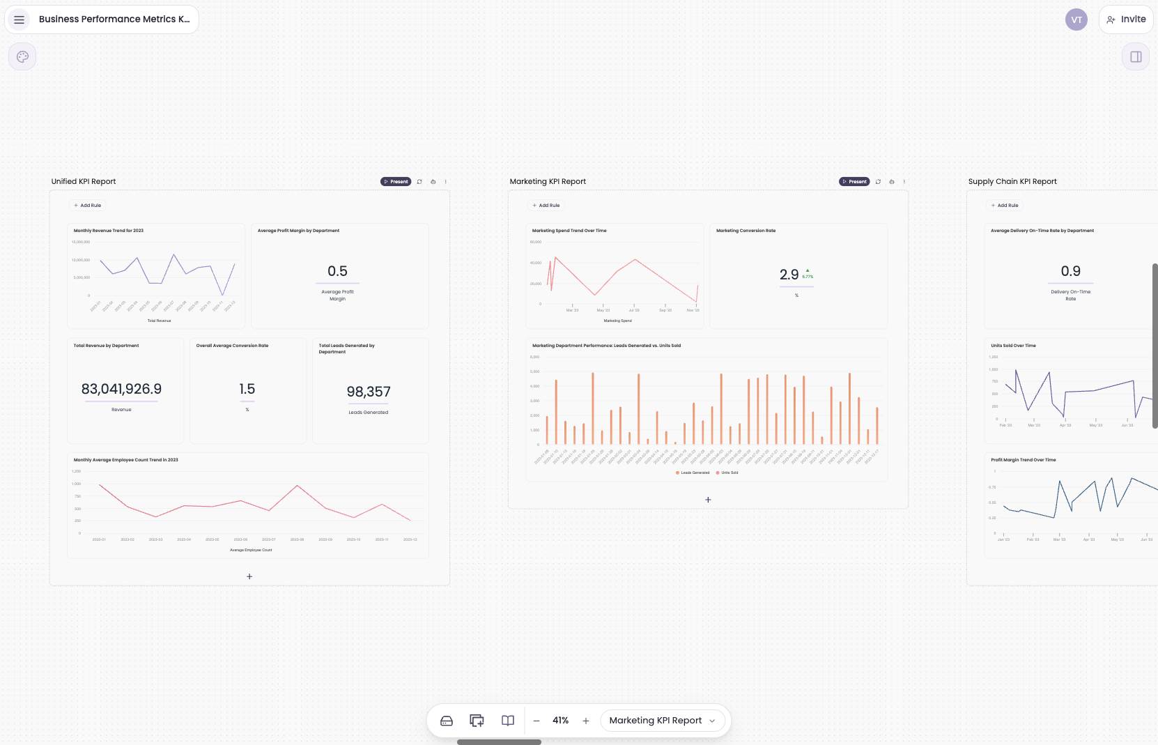
Unify KPIs across every department
Bring finance, marketing, sales, HR, and operations into one holistic view. Align teams around shared goals and act faster with a single source of truth.
Try Breadcrumb →Try for free. No credit card required.
Final Thoughts
KPI reporting shaped my leadership style and improved the way I plan. It gives me clarity during uncertain moments and confidence when I need to make important decisions. When I see my KPIs presented clearly I understand the real story behind performance and I know exactly where to focus next.