
August 14, 2025 - By: Victor Tang
We Rebuilt the Canvas Around How You Work With Data
Breadcrumb's redesigned dashboard brings chart controls, space management, restore checkpoints, and enhanced AI transparency—all designed to help you get insights faster with better visibility into your data analysis.
At Breadcrumb, we’ve always believed that analytics should feel dynamic, intuitive, and fun to use. That’s why we’re excited to introduce a full dashboard redesign based on how real teams like yours use the product every day.
It’s a rethink of how people interact with data when they need answers fast.
The new dashboard layout brings everything you need within reach. It’s designed for speed, clarity, and focus — helping you and your team get to insights faster.
Let’s explore what’s changed and why it matters.
Why We Redesigned the Dashboard
Over the last few months, we’ve observed how users build reports, switch between spaces, customize charts, and revisit previously generated insights. The patterns were clear: people needed more flexibility, less clicking, and fewer blockers between asking a question and getting a clear, actionable answer.
So we made it all more accessible — right where you need it.
What’s New in the Redesigned Dashboard
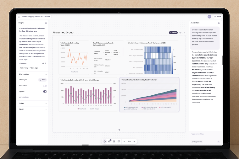
Left Panel for Chart Controls
You no longer need to jump into separate settings. With our new left-hand chart control panel, you can instantly adjust filters, dimensions, chart types, and styles — without breaking your flow.
Whether you’re fine-tuning a KPI card or exploring deeper trends, the tools are always within reach.
The new left panel gives you instant access to chart controls and filters
Control Bar for Managing Space Rules
Managing a dashboard space — especially across teams or clients — just got easier. The new control bar gives you quick access to data settings, create new groups, and rules that govern how data is shown and shared.
It’s your command center for making dashboards work the way you want.

The control bar provides quick access to data settings and space management
Restore Checkpoints for Previously Generated Insights
Ever generated a great insight and wished you could go back to it later?
Now you can. With restore checkpoints, you can revisit and reload previously generated insights with a single click — perfect for iteration, collaboration, or simply reviewing your past thinking.
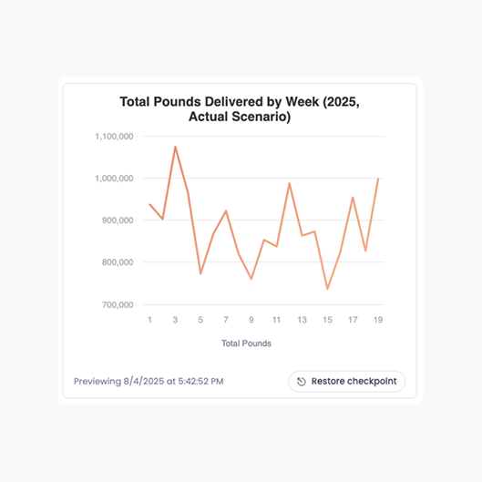
Restore checkpoints let you revisit and reload past insights with a single click
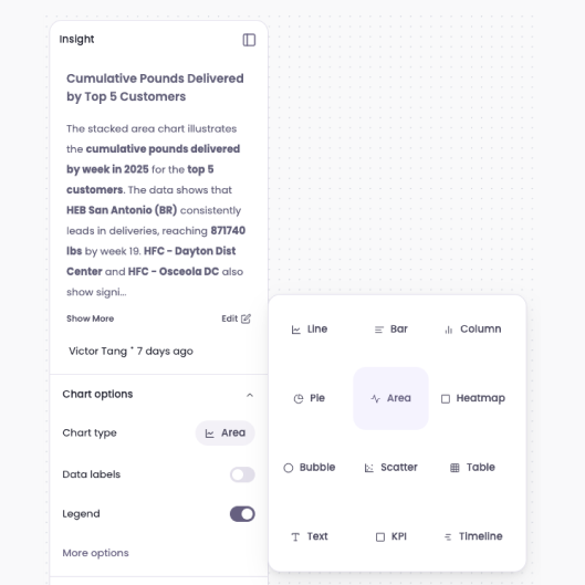
Redesigned Visualizations and More Chart Options
We’ve modernized our visual components and expanded your charting options — so your reports not only look cleaner, they also tell the story better. New styles, improved defaults, and smarter visual spacing mean every chart is easier to scan and act on.
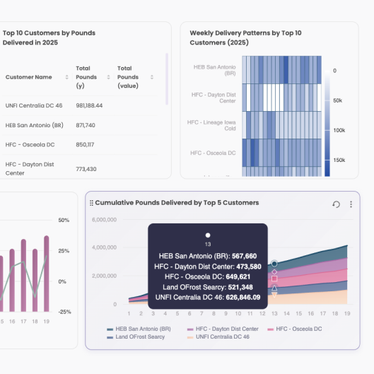
Updated chart styles and visualization options make insights clearer and more impactful
Improved AI Feedback with Steps and Calculations
Transparency in AI-generated insights is crucial for building trust and understanding. Our enhanced AI now shows you exactly how it arrived at each conclusion — displaying the step-by-step calculations, data transformations, and reasoning behind every insight.
Whether you’re analyzing revenue trends, customer behavior patterns, or operational metrics, you’ll see the complete thought process. This makes it easier to validate results, explain findings to stakeholders, and iterate on your analysis with confidence.
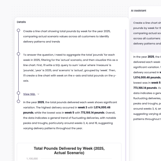
The enhanced AI now displays step-by-step calculations and reasoning for every insight
Built Around How You Work
This update is more than visual polish — it’s shaped by user behavior.
From how you switch views and tweak metrics to how you manage multiple spaces, we’ve made Breadcrumb’s interface feel more natural, more helpful, and more powerful. Everything’s just… handier.
Try the New Dashboard
Ready to see the redesign in action?
You can explore the new experience today — or if you’d like a guided walkthrough tailored to your use case: