October 22, 2025 - By: Victor Tang
Pivot Tables vs. Pivot Charts: How I Decide Which One to Use
How I use pivot tables for exploration and pivot charts for communication—when to choose each and how they work together.
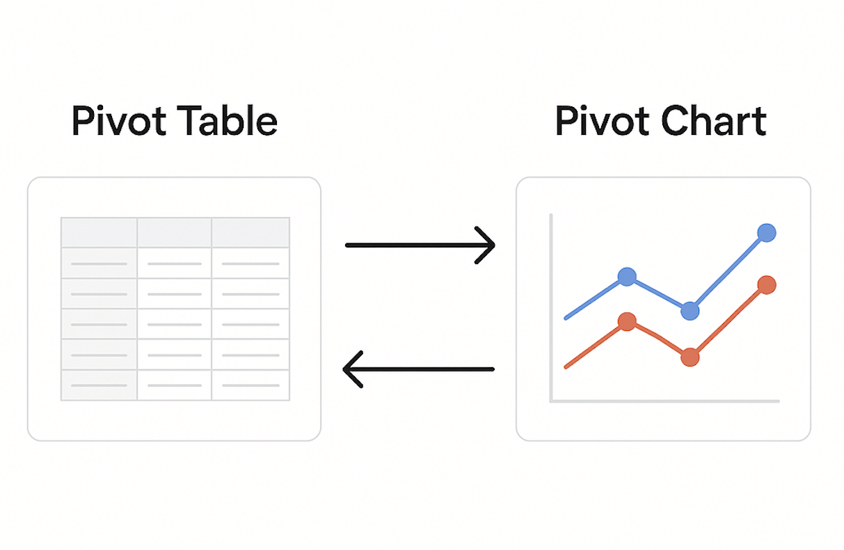
I have lost count of how many times I have built a pivot chart only to realize it is essentially the same as my pivot table, just visualized in a cleaner and more expressive way. Earlier in my career, I used to think of pivot tables and pivot charts as separate tools, one meant for analysis and the other meant for presentation.
Over time, I realized they are deeply connected parts of the same process. They both rely on grouping and summarizing data, turning complexity into something easier to reason about.
For me, pivot tables are where exploration begins, while pivot charts are where communication happens. One helps me find patterns and test assumptions, the other helps me translate those discoveries into something anyone can understand in seconds. Once I started viewing them as partners rather than separate tools, my workflow became more natural and my insights more impactful.
The Key Takeaways
A pivot table helps me explore and understand what is happening in the data, while a pivot chart helps me communicate those insights clearly to others.
- Pivot tables and pivot charts are not competing methods, they are companions.
- Pivot tables help you ask questions and uncover insights.
- Pivot charts help you share answers and communicate findings.
- The key is knowing when you are in exploration mode versus communication mode.
- In my workflow, I always start in the pivot table, where the data starts talking back. Once I understand what it is saying, I move to the pivot chart, where others start listening.
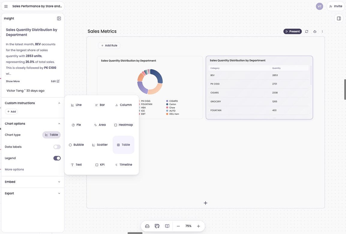
- With AI tools like Breadcrumb, the entire process of pivoting, editing, and visualizing happens in seconds by simply uploading your Excel spreadsheet as a data source. You can explore data conversationally, switch views seamlessly, and focus on the insight instead of the interface.
- That is what makes data feel alive again, not just something you look at, but something you interact with.

Explore pivots and charts with AI
Upload a spreadsheet, ask a question, and get tables and charts instantly.
Try Breadcrumb →Try for free. No credit card requried.
What Is a Pivot Table
A pivot table is one of the simplest and most powerful ways to explore data. It helps you transform large, messy datasets into structured, meaningful insights within seconds. You can take thousands of rows of transactions, campaigns, or user interactions and summarize them by key dimensions such as region, product, or month. It is the fastest way to move from data chaos to data clarity.
Essentially, a pivot table helps you:
- Group data (for example, by product, date, or region)
- Aggregate it (for example, using sum, average, or count)
- Filter and slice it dynamically to test different angles
When I work with pivot tables, I can rearrange columns, adjust filters, or add new groupings instantly. It feels like sketching ideas with data. I can test theories, confirm relationships, and validate results without needing to code or wait for reports. Pivot tables are the foundation of my analysis process because they give me full control over how I look at the data before I ever move to visualization.
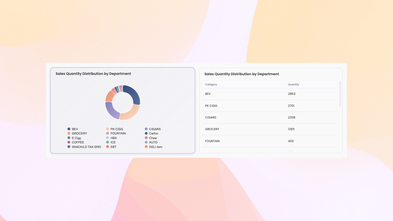
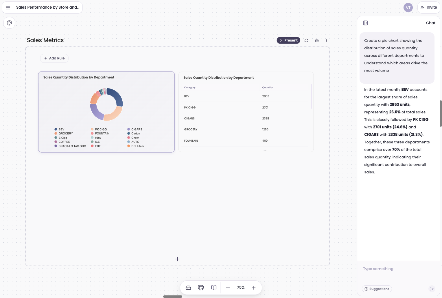
Example: Revenue by Region and Quarter Pivot Table
When I want to understand overall sales performance across different regions, I start with a pivot table. I take a dataset that includes individual sales transactions, with fields like region, sales amount, and quarter. By grouping the data by region and summarizing it by total sales, I can immediately see which regions are performing the best and which ones might need attention.
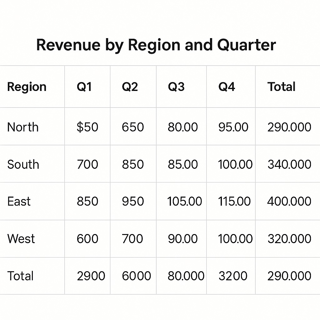
If I want to go deeper, I add another layer by breaking the data down by quarter. This lets me see not only which regions have the highest revenue but also how that revenue changes over time. A quick sort or filter shows me trends, anomalies, or sudden drops. This step is all about discovery. The pivot table gives me the answers to the questions I am still forming in my head.
If you are working from spreadsheets, these tips help a lot: How to Prepare Your Spreadsheet for Data Analysis.
What Is a Pivot Chart
A pivot chart is a visual representation of the pivot table. It takes the same summarized data and expresses it visually through bars, lines, columns, or pies. A pivot chart automatically updates when you make changes to the underlying pivot table, which keeps exploration and communication perfectly in sync.
Pivot charts allow you to see patterns and relationships that would be easy to miss when looking at numbers alone. Trends appear instantly, comparisons become obvious, and outliers stand out right away. They transform rows of data into stories that are easier to share and understand.
When I create a pivot chart, it is because I have already found something interesting in the data that is worth communicating. Charts are not just decorative; they are explanatory. They help me turn the logic of a pivot table into something visual that sparks action.
Example: Revenue by Region and Quarter Line Chart
Once I have identified a pattern in the pivot table, I turn it into a pivot chart to communicate it visually. Using the same regional sales data, I might create a line chart that shows total sales by region over each quarter. Instantly, the growth trend in one region and the plateau in another become clear without anyone needing to read a single number.
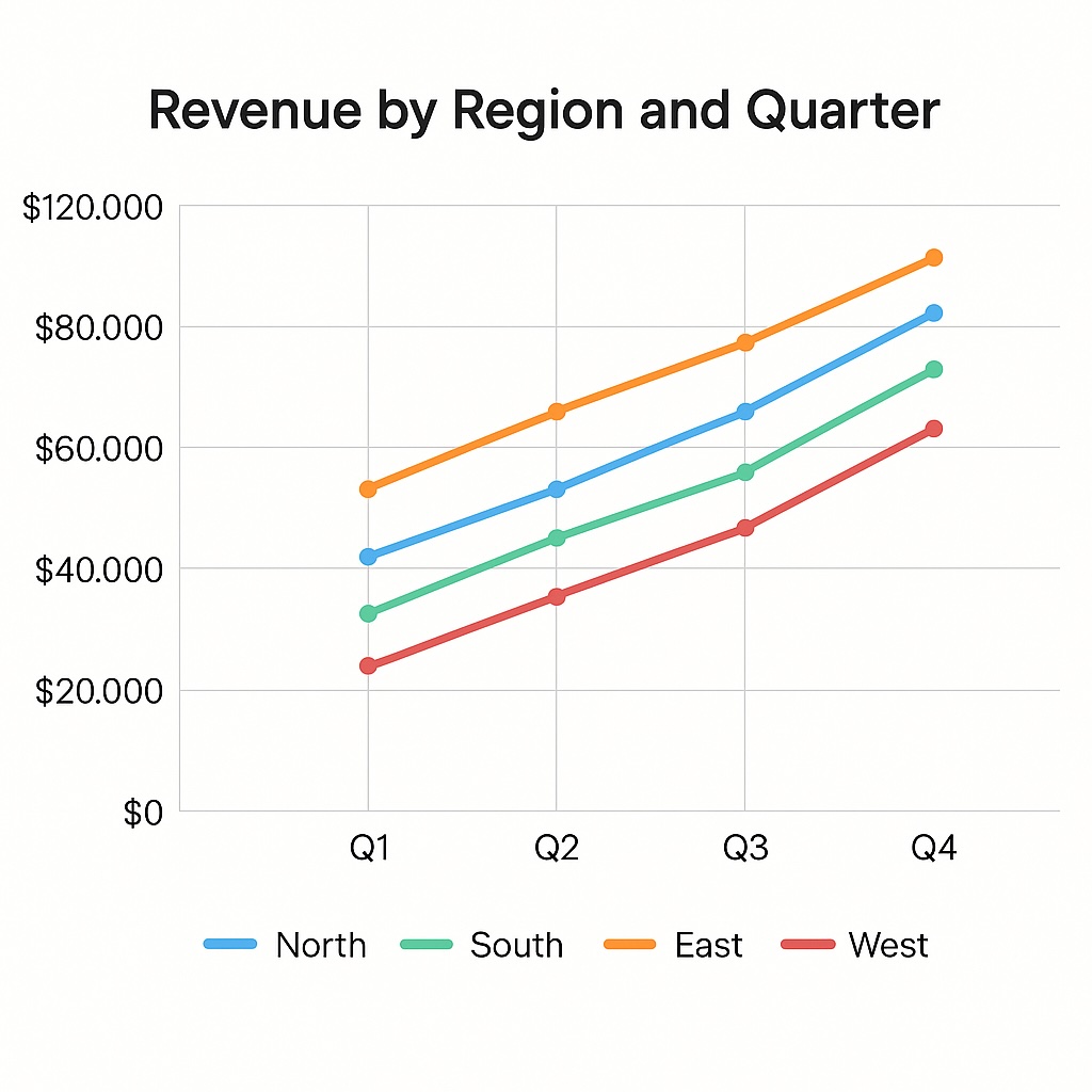
If I am sharing this with a team, I might use a column chart instead, comparing total sales side by side. This makes it easier to talk about which region is leading and what might be driving the difference. The pivot chart turns my exploration into a story that others can see and respond to. It takes the insights hidden in rows of data and makes them visible at a glance.
For turning insights into a clear narrative, see How to Present and Share Reports in Breadcrumb.
Other Common Pivot Chart Examples
There are many ways to visualize a pivot table, and each chart type serves a different purpose. Choosing the right one depends on what you want to highlight or communicate. Here are some of the most common pivot chart examples I use in my own work:
- Column chart: Best for comparing categories side by side, such as sales by region or revenue by product line.
- Line chart: Ideal for showing trends over time, like month-over-month growth or website traffic changes.
- Bar chart: Useful when you have long category names or need to display comparisons horizontally for clarity.
- Pie or donut chart: Great for showing proportions or parts of a whole, such as market share or expense breakdowns.
- Area chart: Works well for emphasizing cumulative change or highlighting how segments contribute to a total over time.
- Scatter plot: Perfect for exploring relationships or correlations, such as ad spend versus conversions.
- Combo chart: Combines multiple chart types, like bars and lines, to show related metrics with different scales or units.
I think of these chart types as different storytelling tools. Each one gives your data a different voice. The key is not just choosing what looks good, but choosing what helps people understand your insight fastest.
Breadcrumb allows me to use AI to switch between table and chart types. I can instantly transform my data view from a detailed pivot table to any visualization that best tells the story.
How Pivot Tables and Pivot Charts Work Together
A pivot table and a pivot chart are not two different systems, they are two stages of the same conversation. A pivot chart cannot exist without a pivot table because it relies on that underlying summarized data. The pivot table does the organizing and calculating, while the pivot chart handles the visual storytelling.
My process is simple. I start with a pivot table to explore the data and identify what matters. Once I have discovered a relationship or pattern, I create a pivot chart to visualize it. From there, I often move back and forth between the two, adjusting filters, changing dimensions, or adding new metrics. This loop of exploration and visualization helps me think faster and explain findings with more confidence.
Why Pivot Tables Should Not Take Long
In the past, building pivot tables could be slow and frustrating. You would spend time dragging and dropping fields, waiting for recalculations, and trying to reformat everything just to test a new idea. It often felt like the tool was getting in the way of thinking. But analysis should not feel like that. Pivot tables should be fast, flexible, and easy enough to keep up with your curiosity.
That is why I find AI-powered tools like Breadcrumb so transformative. Instead of spending time setting up pivots manually, I can simply ask, “Show me total revenue by region over the last three quarters.” Within seconds, Breadcrumb builds the pivot automatically. I can then switch between the pivot table and the pivot chart instantly, add or edit columns with a quick prompt, filter or regroup the data in conversation, and visualize any view without needing a separate setup.
This makes the experience of working with data seamless and fluid. I no longer waste time on setup or configuration. I stay focused on the insights themselves. The entire process feels natural, interactive, and fast enough to match how ideas form in my mind.
See how to build pivots and switch to charts with AI.
Read the guide →When to Use a Pivot Table vs. Pivot Chart
Deciding when to use a pivot table versus a pivot chart depends on your goal. I use pivot tables when I am still exploring, testing, and validating data. I use pivot charts when I am ready to share, communicate, or highlight a key point visually. Together, they form the full cycle of data understanding.
I use a pivot table when:
- I am exploring or validating data
- I need exact numbers for accuracy
- I am testing different groupings or filters
- I am diagnosing performance or tracking anomalies
I switch to a pivot chart when:
- I have found something worth communicating
- I want to highlight a trend or comparison
- I am preparing a dashboard or presentation
- I need to make data easier for others to understand
Here is a quick reference that summarizes when to use each tool and chart type:
Choosing Between Pivot Tables and Charts: A Quick Table Guide
| Goal | Best Tool | Example |
|---|---|---|
| Explore and validate data | Pivot Table | Revenue by region and quarter |
| Show performance trends | Line Chart | Revenue growth over time |
| Compare categories | Bar Chart | Sales by product type |
| Show composition | Pie / Donut Chart | Market share by segment |
| Spot correlations | Scatter Plot | Ad spend vs. conversions |
This framework helps me stay efficient. It reminds me that pivot tables are for analysis and pivot charts are for storytelling. Both are essential, and the magic happens when you move fluidly between them.
How I Think About Charts and Tables
Pivot tables help me understand the data, while pivot charts help me communicate it. They are not different tools but different expressions of the same insight. When I can move fluidly between the two, I stay connected to both the reasoning and the story behind the numbers.
I love how analytics is evolving to make this easier. Tools like Breadcrumb allow me to explore, edit, and visualize data in one continuous flow. There is no waiting, no rebuilding, no switching between screens. I can ask a question, see the answer as a pivot, visualize it instantly, and refine it on the spot.
When analysis becomes this smooth, data stops feeling like static reports and starts feeling alive. It becomes something I can explore, question, and shape in real time, not a task but a conversation.